

Optimizing the Staples Product Details Page
Less Noise. More clarity. REFINED.
Rethinking key shopping interactions to help customers evaluate products and navigate the purchasing experience.

OVERVIEW
The Staples' Product Details Page made it difficult for users to quickly identify key reassurance information and distinguish primary shopping actions from secondary ones. Important trust signals, such as free returns, lacked visibility, while actions like sharing, comparing, and saving competed for visual attention.
SOLUTION
To improve visibility of Free Returns messaging, I repositioned it within the PDP to make this key reassurance information easier for customers to notice. I also streamlined secondary actions by replacing the text labels for Share, Compare, and List with familiar icons, reducing visual clutter while maintaining access to essential shopping tools.
PROBLEM
Free Returns
The "Free Returns" messaging is very low on the page, and it's small and can easily be missed. It's also on the left side of the page under the picture, making an important purchase-confidence easy to overlook.

Breaking down the
PROBLEM
Share, Compare, and List
The Share, Compare, and List actions competed for attention with higher-priority purchasing information and added visual density to the page. It's also not consistent with industry standards.
The Goal
prioritizing
To enhance SKU page usability by key trust signals and secondary actions.
simplifying
INDUSTRY
eCommerce
MY ROLE
Competitive Audit
UX Research
Design
TOOLS
UserTesting
Figma
DURATION
2 months
COMPETITIVE AUDIT
How do other retailers handle Free Returns and secondary product actions?
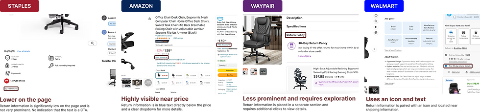
To understand industry standards, I reviewed product pages from major retailers to see how they communicate return information and Share, Compare, and List actions. I looked at placement, visual treatment, overall clarity of these elements.
How do retailers communicate return information?
DESKTOP
KEY TAKEAWAYS

01 Return information is typically placed near the price/shipping information
02 Familiar icon and text patterns are commonly used
03 Link or dropdowns indicate extra information
MOBILE

2
Share, Compare, and List
How do retailers communicate secondary actions share, compare, and list?
MOBILE

KEY TAKEAWAYS
01 Familiar icons (heart and share) are commonly used
02 Secondary actions are visually separated from primary purchase actions
03 Staples is the outlier in grouping all three actions with text labels
DESKTOP

1
Free Returns
01
Can users identify the share option?
02
Can users identify the save/list option?
03
Do users understand what each icon does without text labels?
10 PARTICIPANTS
Ages 22 - 34
Frequent online shoppers
Share, Compare, and List
The competitive audit revealed a strong pattern of using a heart icon for saving to a list and the box arrow icon for sharing. Because replacing text labels with icons could introduce discoverability issues, I tested these patterns by conducting a before incorporating them into the redesign.
METHODOLOGY
remote usability test with 10 users
USER RESEARCH
REMOTE, UNMODERATED TEST
Conducted via UserTesting. Participants were shown the SKU page and asked to identify and interact with secondary actions.
PARTICIPANTS
TEST TYPE
KEY TASKS
01 Find the share option
02 Find the save/list option
03 Explain what each icon does

WHY I TESTED THIS
While icon-only secondary actions are common across retailers, I wanted to ensure that users would recognize these icons without text labels and understand what each action does
RESEARCH GOALS
KEY FINDINGS
10/10
users recognized the share and heart icons without needing text labels without needing text labels
Users frequently referenced familiar patterns from platforms like Amazon and Walmart. Participants consistently described icons as "easy to find," "very intuitive," and "common." There was no significant hesitation or learning curve observed during the test.


WHAT USERS SAID

The share button is very clear… it’s the same everywhere so it’s easy for me to spot it.
This icon [heart] means I like it and I wanna save it—I’m used to interacting with this.
These are super simple and easy to locate. When I want to share a product with my friend or save it for later, it's right there!
RESEARCH TAKEAWAY
Familiar Iconography reduced the need for text labels,
supporting the decision to replace the existing Share and Add to List actions with recognizable icons.
Icons tested without text labels
DESIGN EXPLORATION
GOAL: To make "Free Returns" easily discoverable while keeping it consistent with the existing SKU Page design and brand. It was also important to communicate that returns are always free to ensure customers feel more confident in their purchase.
OPTION 1 - BLACK TEXT

+ Learn more indicates tooltip
- Could blend into surrounding text
OPTION 2 - BLUE TEXT

+ High contrast, consistent with Staples link styling
- Potentially heavier than surrounding text
OPTION 3 - ICON + BLUE BACKGROUND


SELECTED DIRECTION
+ Highest discoverability
- Introduces a stronger visual element into an already dense area
WHY I SELECTED THIS
This direction increased discoverability without introducing a new component style and aligning with Staples design
1
Free Returns
Share, Compare, and List
GOAL: To reduce visual clutter on the right side of the SKU Page while keeping the key functionality accessible. I explored different ways to present Share, Compare, and List that aligned with industry standards and the existing Staples design system.
SELECTED DIRECTION
2
OPTION 1 - RED FILLED ICONS

+ More visually prominent
- Feels heavier on the page
- Doesn't align with Staples' minimal design
OPTION 2 - OPEN ICONS

+ Clear labels, easy to understand
+ Consistent with Staples button styling
- Could blend into the background
A cleaner, more focused Product Details Page
FINAL SOLUTION
I refined the Product Details Page to bring important trust information into focus and make secodary actions easier to discover without adding visual clutter.
1
BEFORE
1
STRENGTHENED TRUST SIGNALS
Free Returns was moved higher in the purchase journey and given stronger visual emphasis.
2
SIMPLIFIED SECONDARY ACTIONS
Share and List were converted into familiar icons to reduce visual density.
FINAL SOLUTION
1
AFTER


DESIGN AND HANDOFF
I translated the solution across desktop, tablet, and mobile while preserving the same information hierarchy and interaction patterns.


