
WiscWallet
Making student finances easy to understand and manage
A mobile financial management experience designed to help UW-Madison students better understand their spending, explore discounts, and manage everyday financial tasks


OVERVIEW
PROBLEM
Students at UW Madison regularly rely on their Wiscard (student ID) for daily activities such as entering campus buildings and paying for food at dining halls. Yet, many students find it challenging to manage their Wiscards due to the complex process of adding funds on the web-based management application. This complexity often results in frustration and inefficient use of the card.

SOLUTION
What if there was a way to streamline the process by adding features such as instantly adding funds, tapping to pay, and real-time balance check. Think banking app meets Wiscard management: A modernized app that simplifies the management process. The app eliminates the cumbersome steps involved in a web-based management system, offering a modern and intuitive user interface.
INDUSTRY
Banking/Finance
MY ROLE
User Research
UX Design
Branding
TOOLS
Mural
Figma
DURATION
3 months
.png)
The Goal
To the Wiscard management process, enhance the Wiscard experience, and user engagement
simplify
improve

simplify


CURRENTLY
NEED TO LOG IN EVERY TIME
1
10
NEED TO LOG IN EVERY TIME
MYUW HOME > FIND WISCARD "APP"
WISCARD ACCOUNT MANAGEMENT
AND GO THROUGH MULTI-FACTOR AUTHENTICATION
WISCARD ACCOUNT MANAGEMENT
DEPOSIT PAGE

WISCARD DEPOSIT DROPDOWN

SWITCH TO CREDIT CARD
DEPOSIT PAGE

FIND WISCARD NUMBER EVERY TIME

FILL OUT NAME, CARD NUMBER, EXPIRATION DATE, CVC, BILLING ADDRESS, AND EMAIL EVERY TIME
FILL IN AMOUNT
FILL IN AMOUNT

COMPLETE PAYMENT
USER RESEARCH & ANALYSIS
Before diving into the design process, it was crucial for us to understand and prioritize the needs of the users. Gathering user insights early on ensured that our solution would directly address user’s pain points and create a truly user-centered experience.
To gain these insights, we conducted six in-person structured interviews focusing on banking app usage and tap-to-pay functionality.
We also explored the challenges students faced while using their banking apps and the Wiscard online portal. By asking participants to demonstrate the steps they take to complete specific tasks—such as adding funds or making a payment—we observed their interactions with both systems. This helped us identify opportunities to blend features from both platforms into a new, unified Wiscard management system, addressing key pain points to improve the overall user experience.
Additionally, we timed the process of using a physical Wiscard versus accessing the banking app on their phones to compare which method offered a faster, more efficient payment experience.
OBJECTIVES
1
2
3
FINANCIAL MANAGEMENT & PAYMENT PREFERENCES
How do students manage their personal finances within their banking app and Wiscard and what are their preferred payment methods?
PAIN POINTS & CHALLENGES
What challenges do students face when using banking apps and the Wiscard online portal, especially for adding funds and making payments?
FEATURE PREFERENCES & EFFICIENCY
What banking app features do students like and dislike, and how efficiently do users pull out their Wiscard vs. phone
AFFINITY DIAGRAM
After conducing interviews, we wanted to visually map out students' feedback to consolidate findings into key insights to drive our app design. Below is the affinity diagram categorized into five main different categories.

We wanted to considerate our findings further to really key in on the main themes and pain points users faced when using the online Wiscard portal and their banking apps.


It's a hassle to load money into my Wiscard. I wish there was an easier way.
Some Notable Quotes
“I just use my credit card. I don’t want to take the time to load money in, and I keep forgetting how to. I would use the Wiscard more if there was an easier way to transfer in money”
"I work at Java Den [coffee shop] and so many people try to use their Wiscard here. They cannot use it here, it’s not a campus affiliated coffee shop."
“I had to pay 70 dollars to replace my Wiscard, when I barely use it. It was expensive”
MAIN TAKEAWAYS
⏳ INEFFICIENT SYSTEM
Existing Wiscard Management System has too many steps to manage funds, and the online portal is laggy. This makes management a tedious task that students avoid.
💾 LACK OF FEATURES
Students want the ability to save bank information for ease of adding money. There is no way to transfer unused Wiscard money back into their bank accounts.
🪪 PHYSICAL CARD NOT NEEDED
Some students only use their card for printing, which just requires the Wiscard number and not the physical card. Because of this, the physical card can be easily misplaced.
🏷️ MISSED OFFERS
A lot of students are unaware of where they can use their Wiscard for discounts or how much they can save, leading to missed savings opportunities.
MARKET RESEARCH
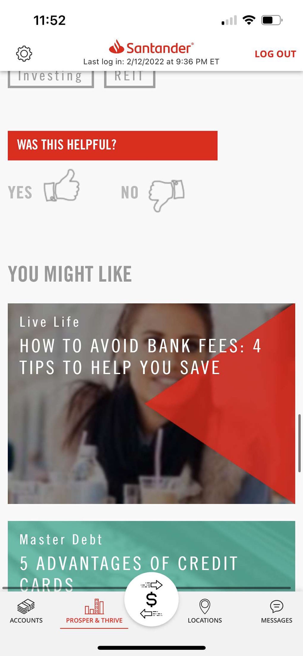
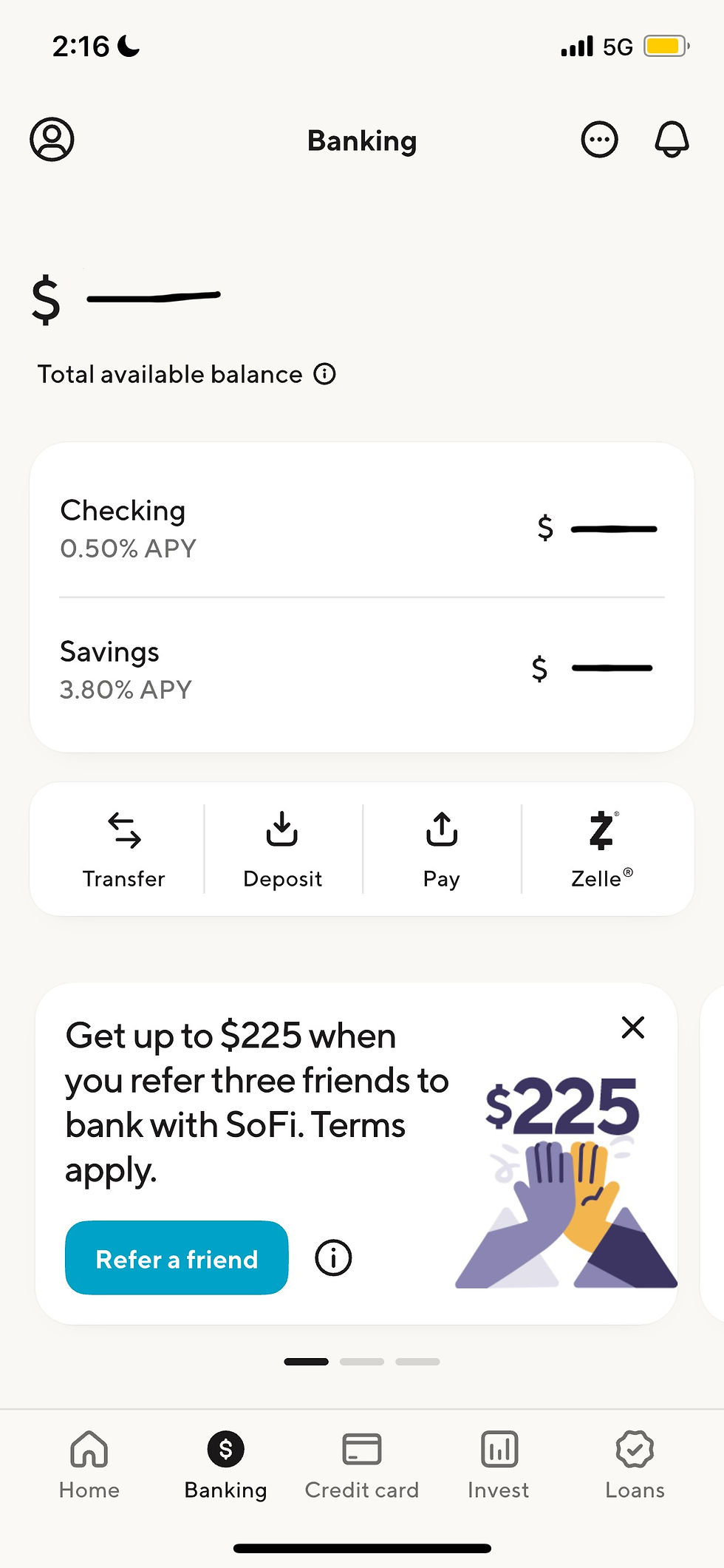
Since the design goal is to create a blend between the Wiscard Management portal and a banking app, it was crucial to conduct some market research to see what banking apps are doing well so we can use inspiration for our own design.
1
SANTANDER



2
CHASE


SOFI
3


IDEATION
BRAINSTORM
After assessing different user needs and pain points from our user interviews, we wanted to identify key themes so we could prioritize 3-4 points in our app design. We conducted a brainstorming sticky note activity and came up with the following ideas:

We then voted on our top options for what to include in our Wiscard Management app. This allowed us to set priorities for what to build out.
1
1
Uncover how users manage their personal finances in a general sense

From our brainstorming activity, we discovered that our top priorities were:
1
2
3
TRANSFERRING MONEY
Enables users to refund unused Wiscard funds to their bank account or transfer money to friends
DIGITAL WISCARD
The Wiscard integrated as a digital card in the Wiscard app, allowing for tap-to-pay functionality for payment and scanner for entry into dorms, gyms, etc.
DISCOUNT CHART
Discount chart showing amount of discount based on their residency status along with breakdown of Wiscard discounts at various campus locations
BRANDING
Staying consistent with UW Madison and the current Wiscard Management was a main priority for us when it came to branding.
COLOR PALETTE
TYPOGRAPHY
Primary Colors

Heading
Open Sans Bold
Subheading
Open Sans Semi Bold
Lorem ipsum dolor sit amet, consectetur adipiscing elit, sed do eiusmod tempor incididunt ut labore et dolore magna aliqua. Ut enim ad minim veniam, quis nostrud exercitation ullamco laboris nisi ut aliquip ex ea commodo consequat.
Secondary Colors

Open Sans Regular
LOGO

SKETCHES
Before jumping into digital design, we played around with some sketches to visualize potential layouts for the app. We kept it very simple, having 3 main interfaces accessible via the bottom navigation bar. We also incorporated a hamburger menu for profile and settings, and a dedicated interface to show the student's transaction history. and an interface for transactions. Creating this sketch helped us put all of our ideas in one place and begin visualizing how the app would function.


USER FEEDBACK
Reality check! Time to include students in the design process. From a quick usability study using the sketches, we discovered that students prefer:
👤 The profile icon at the bottom navigation bar as opposed to a hamburger at the top
🛠️ The customized dashboard button on the home page is not needed
🧾 The transaction history should have its own page and be an icon on the bottom navigation bar
ADDITIONAL IMPROVEMENTS
-
Transfer page: Transfer should be the default option and pay via should come before search - don’t need to know who you are transferring to unless it’s by email
-
Profile and settings can be one category - there’s not going to be in in depth profile page for this app
-
Digital Wiscard doesn't need its own page, and if we have profile and transaction history as tabs in the bottom navigation bar, then there will be too many icons on the bottom. Something needs to change with the digital Wiscard
LOW-FIDELITY EXPLORATIONS
Taking it one step further, we created a low-fidelity prototype, to visually map out our design concepts to see how it all comes together. We incorporated a few of the "Discount Chart" interfaces and a pop-up for the Digital Wiscard and changes based on user feedback and our additional imporvements that we thought would be helpful to bring everything together.


MEET WISCWALLET
HOME PAGE
Features student's Wiscard number for easy access, current Wiscard balance at the top, a transaction history snippet, and a place to check discounts. Floating Wiscard button on all interfaces.
TRANSFER MONEY
On this screen, the user can transfer money to and from different payment types, whether it be from their bank account, to their Wiscard, or to friends. The default transfer money page shows the “to” and “from” drop-downs, the transfer amount, and the transfer button. A "pay via" section will pop up accordingly.


DIGITAL WISCARD
Includes a digital version of the Wiscard, text that tells the user to hold their phone near the payment or building-access reader. Below that is an option for users to generate a barcode if their phone cannot be “read” for any reason.
HIGH-FIDELITY PROTOTYPE
Taking all of the research, sketches, prototypes, and insightful conversations with the team, we crafted a high-fidelity prototype.
LOGIN

TRANSACTIONS
HOME PAGE
TRANSFER
TOP DISCOUNTS
DIGITAL WISCARD
DISCOUNT DETAILS

PROFILE & SETTINGS

REFLECTION & NEXT STEPS
CHALLENGES
CONSOLIDATING USER NEEDS
While users shared the common goal of having better control over their money, the ways they wanted to accomplish that varied. Some prioritized quickly checking their balance, while others needed more visibility into transactions, spending, or adding funds.
With so many observations, pain points, and user needs to consider, I had to identify common themes and consolidate them into a few key themes.
BALANCING SIMPLICITY WITH FUNCTIONALITY
I wanted WiscWallet to provide enough information for students to feel in control of their finances without overwhelming them with unnecessary data or actions. This required carefully prioritizing content and determining what information should be immediately visible versus accessible through secondary interactions.
DESIGNING FOR DIFFERENT FINANCIAL BEHAVIORS
Designing for a broad student population meant accounting for different levels of financial awareness and different patterns of app usage. I had to create an experience that was intuitive for someone checking their balance in seconds while still providing enough detail for users who wanted to understand their spending.


CURRENTLY...
1
NEED TO LOG IN EVERY TIME
2
MYUW HOME > FIND WISCARD "APP"
3
WISCARD ACCOUNT MANAGEMENT
AND GO THROUGH MULTI_FACTOR AUTHENTICATION

6
DEPOSIT PAGE
5
SWITCH TO CREDIT CARD
4
WISCARD DEPOSIT DROPDOWN
7
FIND WISCARD NUMBER EVERY TIME
8
FILL OUT NAME, CARD NUMBER, EXPIRATION DATE, CVC, BILLING ADDRESS, AND EMAIL EVERY TIME
9
FILL OUT AMOUNT
10
COMPLETE PAYMENT